Live scores, and your favourite sports on the go
When Sky Sports approached us, they had already made significant strides in their design system. They had a library, colour schemes, and font styles, which visually looked impressive. However, the issues they faced included:
Inconsistent Design Application: Despite having a design system, consistency across components was lacking.
Process Deficiencies: There was no clear process for updating and maintaining the design system, leading to outdated or missing elements.
Collaboration Challenges: Teams struggled to collaborate effectively due to the absence of clear guidelines.
Auditing Typography
As part of our comprehensive audit, I conducted an in-depth review of typography usage across Sky Sports' mobile and tablet platforms. Collaboration with the Sports team was crucial during this phase to ensure alignment on essential elements and identify areas for improvement. Here are the key findings and actions taken from the typography audit.
Unclear Naming Convention
Issue: The naming convention approach was unclear to designers. Styles were named by category followed by a number and, in some cases, the use case (e.g., body 1, body 2 article, body 1 medium, headline 4).
Impact: This lack of clarity made it difficult to maintain consistent typography across the product. Designers weren't linking styles to components; instead, they would assign sizes and line heights as they saw fit, resulting in an overly extensive typography set within the product.
Excessive Font Styles
Issue: Over 200 font styles were in use, including those from the system as well as additional sizes and line heights that were not part of it. Additionally, multiple font libraries were being used.
Impact: This variety made it difficult to maintain a cohesive visual identity and added unnecessary complexity to the design system.

Typography & Visual Exploration
Given the excessive number of font styles with minimal differences, our task was to create consistency without altering the established visual appeal of the designs. Our goal was to reduce disparities, make the design system easier to use, and improve its adoption.
Identifying Key Typography Styles
Grouping Similar Styles: By grouping similar font styles, I identified redundancies and unnecessary variations.
Selection Criteria: The criteria for selecting key styles included readability, scalability, and alignment with the overall visual identity.
Harmonising Styles: Adjustments were made to harmonise typography styles across different elements such as headings, subheadings, body text, and captions.
Maintaining Look and Feel: Care was taken to ensure that changes maintained the original look and feel of the designs, preserving the brand’s visual identity.
Testing the Consolidation of Sizes
Screen Duplication: I began by duplicating existing screens to create a sandbox environment for exploration. This allowed me to experiment with different typography styles without affecting the original designs.
Side-by-Side Comparison: Each modification was compared with the original to ensure the visual integrity remained intact. This iterative process helped identify the most suitable styles.

Introducing the New Typography Stack
One important detail about the old typography set is that it included different sizes for mobile and tablet. I spoke with the developers to confirm whether they were using separate fonts, and they weren’t. Instead, they were implementing mobile sizes and adjusting font sizes for mobile and tablet based on users' accessibility preferences. As a result, the mobile and tablet font stacks were also consolidated.

Naming Convention: A Fresh Approach
After finalising the typography set and consolidating sizes and line heights without impacting the product, the next step was to establish a clear and user-friendly naming convention.
Benchmarking for Inspiration
To find the best solution, I conducted a benchmark and discovered some great examples. One system stood out for its simplicity, using only two categories: headline and body. Initially, I thought this might work well for us, so I tested it within the product. However, it felt too broad and lacked the structure needed to maintain consistency across the product.
The Chosen Method
I then explored another approach that combined simplicity with clarity: organising styles into categories, each with t-shirt sizes. This method struck a balance between being intuitive and maintaining consistency.
Team Collaboration and Approval
I introduced this approach to the UI team, encouraged them to experiment with it, and gathered their feedback. The response was overwhelmingly positive, and the new naming convention was approved.
This was a significant win for the team, paving the way for a more cohesive and streamlined design system!

Documenting Typography Usage
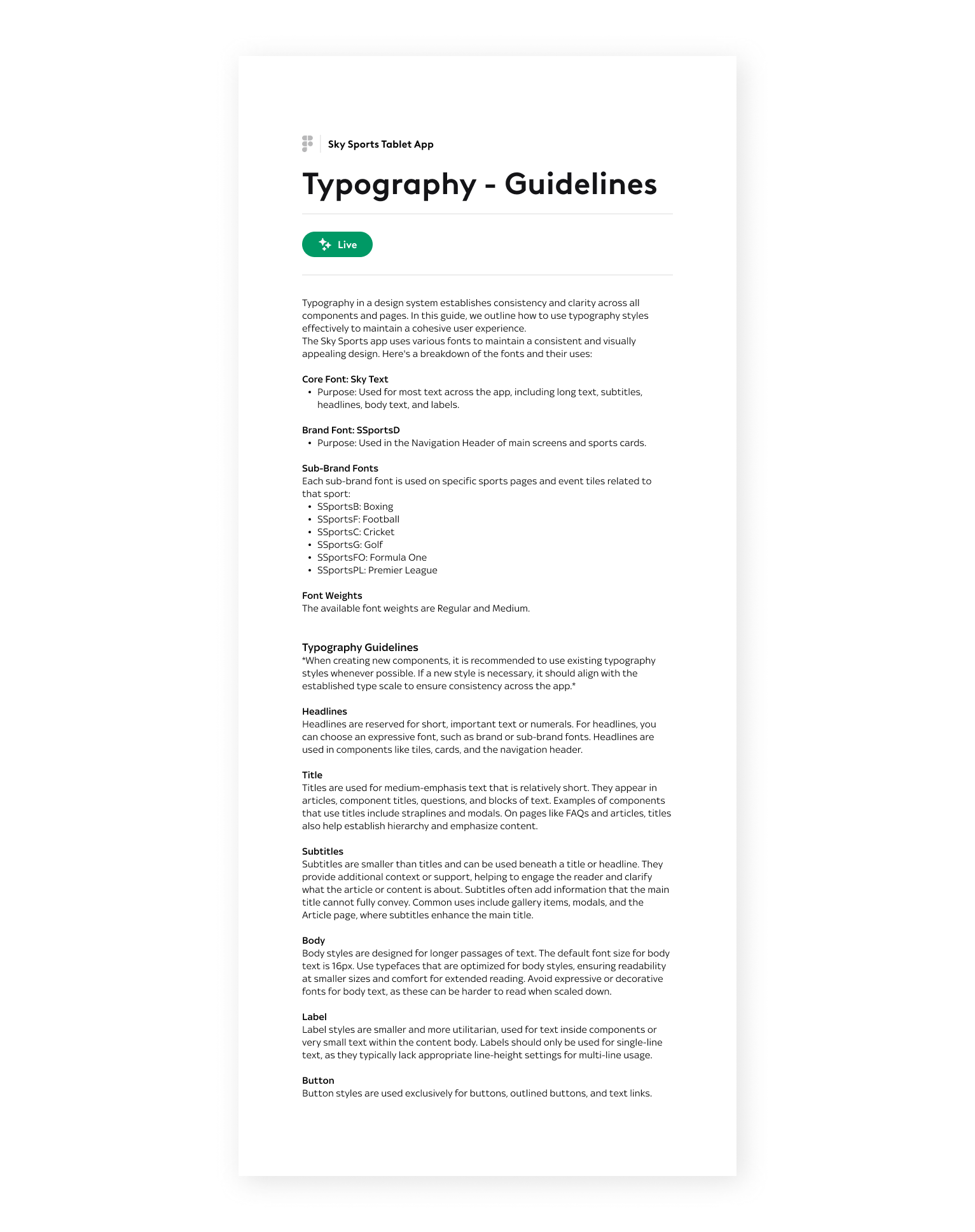
To support the designers on their choice to chose the right font style, I gave them access to the template where we have all the set of categories and the components used in each category. This would be a good clue for them, but it wasn't enough, so I wrote down rules to document how to use each category.


